Put on a Belt & Lose Some Weight

copyright http://www.3-day-diets-central.com/

Be warned that this is a line of personal thinking that led to mini-epiphany about my business, so hang in there – I do have a point.

Let’s talk about fashion. Me? Fashion? [pause for laughter]

Let’s just say that once upon a time, my friend Karen admitted to being tempted to submitting my name to some show called “What Not to Wear.”

I’m not that bad, any more, but I’m no fashionista by a long shot.

But, I used to be. Not exactly a fashionista, but I worked a full time job and did the whole power-suit and heels thing. I was never one for makeup, but I was young and really didn’t need it.

But, the mid-thirties hit, I got a transfer to a different department where the dress code was relaxed, yada yada yada. But the truth is, I gained weight. And “cute clothes” became something I no longer felt comfortable wearing. So enter FrumpyWear – your answer to hiding those extra bulges with floppy and loose clothing.

No one was fooled.

Right  now, I’m digging the jeggings thing  – but because I have scads of embroidered studio dress shirts that I ordered WAY too large. They’re like a dress on me. SO, big shirt plus jeggings plus cool black boots with buckles on them = a look that covers stuff up, yet looks a little fashionable. I’m digging it. I think it looks cute. I get lots of compliments on the boots, anyway, so I’ll take it.

I haven’t asked my husband how he thinks it looks because I know he will tell me he thinks I should put on a belt. He is okay with the pounds I’ve put on since I met him – and to be honest – when I met him I was probably 10 pounds under what I should have been. So yeah, in the grand scheme of things, I don’t have a LOT of weight to lose, but for some reason, over the past 10 years or so, I’ve “let myself go.”

*GASP*

I would *SO* put on a belt – if I was skinny.

So, I was musing these thoughts when I was getting dressed this morning (burgundy shirt/denimn jeggings), and I really started to wonder what the hell was wrong with me that I had not made the effort to trim down those pounds. I could stand to lose 35 pounds. That is usually the goal every time I try to lose weight. And generally, I’ll get down 10 pounds or so before I fall off the wagon and never get back on, Then I gain it back.

Once I got to 6 pounds above my goal weight. I was looking and felt great. I was in the middle of a three week run of a stage performance of “Jerry’s Girls.” I think I had 13 costume changes over 2 hours and most of them were slinky and clingy dresses. The sequined kind. With my top secret body-shaper underneath, I was looking pretty good. And then the show ended and I could enjoy food. And I did. Until I had gained it all back.

That was 6 years ago. And now I’m just older. So – what the heck? Seriously? This is what it’s going to be – frumpy your way into old-lady-hood?

I don’t think so.

So – ya’ll have probably figured out I’ll be going on a diet. Yes, but that’s not the point.

I started thinking about my business and whether or not it’s wearing baggy clothes.

Yes, seriously.

For a long time, my office was out of control. Whenever I had a session, I would close my office door because it was right next to the client bathroom and I didn’t want any clients to see the horrid mess on their way to the bathroom. Like a baggy shirt thrown on over the bulges, I was covering up my mess by closing the door.

I could deal with the fat, but I didn’t want anyone else to see it.

Wow.

So, I’ve been on a major reorganizing kick, in my office, studio and home. I completeley emptied out and reorganized the office. I’m revamping policies and procedures, pricelists, packages and any other thing you can think of. I’m paying attention to branding.

It’s time to shape it up and get rid of the excess flab. I’ve made a pile of items on one side of my studio that I am either giving away or selling. I have some gear that I have not used in ages and I gave away a coffee table that looked good, but just was too large for the space it was in. My studio was starting to look too messy for my OCD tendencies and it was no longer a space I was proud of.

We’re streamlining over here. I’m getting rid of the excess and straightening up what’s left.

Sounds like diet and exercise, huh?

 I’d like to challenge all of you to do the same. Start wearing belts. Figuratively, that is. Straighten up what you’ve already got. Start looking-good, both in your physical care and in your surroundings. Ger rid of the frumpy clothes.

I’m revamping the client waiting area of my studio to look more high end. I’m removing anything unframed and staying with the luxury framed items I already have. I’m removing anything from a vendor that they may be able to access and displaying only items available to pro photographers.

Then, I challenge you all to go on a diet. Again, figuratively. Is your filing system a bunch of papers thrown into a box? That’s not healthy (for your business). Get some things straightened up. Get caught up on entering your receipts into Quickbooks. Get better about recording your mileage. Put together an archive system and get a back-up system in place.

We can all improve, just like darn near everyone struggles with 10 pounds.

So – put on a belt and lose some weight! 😉
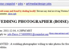
Another Craigslist Tragedy in the Making…

LINK TO ORIGINAL AD

WANTED : A wedding photographer willing to take photos for free (we’re broke college kids) and collaborate with the bride to let her edit them. Dual credit will be given in the event the photos are used for a portfolio.

The wedding will be very small (less than 10 people) and will take place on December 10th, 2011 at 11:30 a.m.

If there is an interest in having a complete range of photos (getting ready to the ceremony, to some more posed photography after the ceremony) please let me know.

The photographer needs to have experience with a camera (aperture, shutter speed, etc) and taking quality photos, but not necessarily wedding photography.

Wow. Just wow. Did you notice that the wedding takes place TODAY? This ad was placed on December 4th. That means SIX days before their wedding, this couple decides to try and do something about their wedding photography.

I was alerted to this ridicuous request by a top-secret informant who felt it only fitting to try and educate this couple, although it will probably fall on dear ears.

Here is the email that was sent by the photographer to the couple. I will update later if a response is received.

I’m going to assume you’re young college students and not really thinking things through. I understand you’re broke, but still want to get married. That’s great. Praises to you.

But honestly…. the one single thing (besides your rings and marriage license) that you will have from your wedding in a year, in ten years, in fifty years, will be your wedding photographs. And you want someone to do them for free? Are you asking for someone to DJ for free? Cater for free? The state to donate your marriage license? Since you’re getting married on a Saturday, that alone is going to cost you $45. How about the rings? The dress? Flowers? Not only that, but you’re asking for hours and hours of coverage.

Do you not have respect for someone’s time to understand that they will spend the entire day on their feet, hauling around several pieces of equipment, dealing with the stress of keeping track of which photos have been taken, which ones haven’t, and listening to people tell them how to do their job the entire day. Yet, the only compensation you’re offering is “dual credit in the event the images are used for a portfolio.” Oh, and maybe something to eat at the reception. I’m going to guess that when you spend an entire day doing a job for someone else, you like to have some cash to go in your pocket. Something that helps to pay your bills at the end of the week. To add insult to injury, you’re asking for someone who has experience and can take quality images. Your photographer, even if they don’t have wedding experience, will have had to have some training in order to have that experience and to take those quality images. Again, you are showing a lot of disrespect by not offering to compensate them for their time.

One last thing to consider…. you don’t care if they have had wedding experience or not. I can tell you right now that taking photos at a wedding is an entire different world, no make that an entire different universe, from taking photos of kids or dogs or flowers or even “creative” self-portraits. Again… your wedding photos will be what you have to look back on about one of the most important days of your life. And you want to risk it by not even caring if the person has experience taking wedding photos.

You might as well buy a $50 digital point and shoot and give it to your neighbor’s kid. At least then you’ll have some “creative angles” to go with the out of focus, poorly exposed, badly cropped images you will likely get. I’m sure that you can just fix it photoshop later since you’re expecting to edit them anyway.

Good luck.

#1 of The 12 Elements of Wootness!:

I’ve recently been working on some print competition images, so I thought this would be a good time to share my “12 Elements of Wootness.” These 12 elements are part of a lecture that I give to professional photographers on print competition. They are loosely inspired by the “12 Elements of a Merit Print,” as published by the Professional Photographers of America. These elements are serious, this is not a parody or satire, but are elements that *I* personally use as a guide in preparing my own prints for competition. I will be sharing them here one at a time and when they have all been presented, I will consolidate them into an ebook available for download in the Fan Club Freebies section. I hope you find these useful in prepping for your own competitions.

1. Enter client images.

Do not enter an image of a family member
or an image that you have become emotionally attached to.

The first element of Wootness has to do with WHO the subject of the photograph is.

It’s my own personal philosophy to only enter client images. I know that there are photographers out there who shoot specifically for competition. That’s fine. For them. It is a personal challenge of mine to create competition-level images every time I do a studio session. Sometimes it happens, sometimes it doesn’t. If I continually push myself to produce competition-level images during regular client sessions, it can only serve to improve my photography in the long run. I’d much ratherbe in a position where my normal work was of a high quality, than to schedule special sessions and have the stars and planets all aligned properly, you know?

The element also says to stick to non-family images. Why? Because it’s very hard to listen to a critique of your image when it is of someone you love. Furthermore, stay away from entering any image that you have developed an emotional attachment to. You need to be objective about your work and you cannot be objective if the image is of your precious children, siblings or an image that you *personally* love.

I became very emotionally attached to the images I submitted to my very first print competition exactly two years ago. I entered 4 images and one did quite well. In fact, it went on to be a merit image at the 2010 International Print Competition. But, I digress…

Anyway, at this particular competition, I entered 4 images that  I really liked. One did very well and 3 did okay. I won 3rd place in Portraits at that competition. I stayed after the awards ceremony because we had the opportunity to meet with master photographers and have our entries critiqued.

A man named Bob critiqued one of my images. I was not being objective. I took the critique very badly and was angry for several days. It actually took me over a year to understand the critique. I had not learned to look at my work critically and objectively. After a full year, I finally realized what Bob was trying to tell me. Fortunately, he is a true professional and was very gracious when I tracked him down and talked to him about it. We’re now like this (fingers twisted).

So, I learned element #1 in a very hard way. I’m all about NOT learning lessons the hard way, so take it from me, stick to client images that are not people related to you or images that you have bonded with emotionally and this will be the first step towards success in competition (and critique-handling).

Dear Client: Please don’t crop off my logo…

Image: renjith krishnan / FreeDigitalPhotos.net

Watermarks are one of those high-emotion subjects that I don’t usually involve myself in. I just put a discreet (and I DO mean discreet) watermark on the sneak peeks I post on Facebook and my blog and go about my business.

But….

The practice of copying these photographs, cutting off the logo and then using the photograph elsewhere has become so commonplace that I must register my disappointment in this practice.

So here’s the deal:

I no longer charge a sitting fee. That means that you come to my studio and I spend at least an hour, and more likely 2 hours photographing you with no compensation. I choose 1-3 favorites from the session, do a full retouch on them (at this point I have AT LEAST an additional 2 hours invested in you) and post a few sneak peeks on Facebook and/or my blog.

I’m not doing this to be nice. I hope you think of me as a nice person, but I’m doing this because I want you to be excited about your photographs. And I *hope* that you share these photographs with your friends.

It doesn’t do me one bit of good if you share these with your friends with my logo cut off.

At this point, I have 3-5 hours invested in your session with no compensation. I’m hoping that you order some photo products and prints to help me recoup my investment in you.

I’m hoping that your friends are suitably impressed with your photographs and they are motivated to call me and schedule their own session based on your photographs. If they don’t see my logo on your sneak peeks, they won’t know who to call. And don’t give me that crap about how they will ask you. They won’t.  Hence the logo.

Furthermore, you have not yet paid me a cent. These photographs do not belong to you to do with as you choose. These sneak peeks are a courtesy and one of the purposes of these is to serve as a little bit of advertising. When you chop off or remove my logo, you have eliminated my chance to gain any further business. If you would like to purchase the digital file, I will prepare it for you WITHOUT a logo and then it is yours to use as you see fit (short of submitting it for publication or selling it for profit). I will have finally earned some income from your session, so all will be square between us.

The situation is further disappointing when the session in question was free of charge. I don’t do many sessions without pay, but when I do, I expect some common courtesy in how the photographs and sneak peeks are shared. If I gift you with a session and package worth hundreds of dollars, I expect that you will be very careful in your treatment of the resulting images.

Now, I know how it goes. Sometimes the clients are not educated and don’t realize that this is an issue. So – take this a PSA. It’s not cool. Please don’t do it. Use the images from your session in the FULL format in which they were given. It’s good Karma.

I know there’s a lot of confusion out there – so let me make a simple clarification. Just because you are in the photo does not mean that it belongs to you. It belongs to me. I am the copyright holder and I am the artist. Yes, you were my lovely subject, but that doesn’t mean a whole lot in the grand scheme of things.

Another point of consideration is whether you are a “model” for my studio. If I have asked you to be a model, it’s not because I’m just a silly woman who wants to shower you with free photo products and sessions, it’s because we are entering a win-win situation. I do favors for you and you do favors for me. The favors you do for me include sharing your photographs with your friends and letting them know where you had them taken. You are a source of advertising for me. Yes, I like you and you like me, but I own a business and this is part of business. If you help me out with getting some potential new clients, I help you out with some complimentary sessions and products. Make sense?

If I continue to have this happen, I will have no choice but to discontinue sharing my photographs. Then where will we be? You will not have photos to share with your friends and I will not have recent photos to show off my photographic skills. Right now I’m one of the FEW photographers that uses a tasteful logo on their photos. Most photographers create the most obnoxious logo that they can or else they place their logo across the faces of the people in the photographs. I hate how that looks and I know that you hate it too. That’s why mine is simple, discreet and a lowered opacity.

I hope this has served to educate. Have a nice day.

Branding is not a Shiny New Logo & Very Special Colors

Ahem. I’m talking to you and you and you.

Obviously not many people know what the hell branding is because their idea of branding is choosing Very Special Colors and designing a Shiny New Logo. Sometimes it’s also buying Cutsie Bags and Ribbons.

Sometimes, ok, MOST of the time, it involves purchasing pre-made logos for $39 or having a logo designer “custom design” a logo for you for less than $100. Seriously? You just paid some hack $50 to churn out a logo for you without knowing anything at all about you, your business, your clients and your product line?

Sure, they asked you what you liked and of course, you really luuuuurrrve polka dots and your favorite colors are pink and brown.

Pardon me while I go retch.

Let’s just suffice it to say that branding is not brown and pink polka dots or cutesy little colorful butterflies flying around your name. Seriously? What are you telling me? That you manufacture neon green and hot pink butterflies?

Um. No. Just. No.

I’m going to give you all a break on this subject and not lecture you too badly, because I realize that not many of you have backgrounds in advertising or marketing and have been sucked into the (wrong) concept of what branding isn’t.

Since *I* am not a marketing or advertising guru, either, I’d like you to review A Practical Guide to Branding, published by the fine folks at Business Week. This should at least clear up any misconceptions about what branding is.

Now that you have a little bit of an idea  – sit down and rehash what your branding needs to say about your business. If you are entirely clueless, I recommend that you hire an expert to help you.

One of  the best things you can do to help a professional help you (or just help YOU help you) is to have a good, solid idea of what your business is all about and the goals you have for your business as well as your clients.

A very good resource can be found at the Brand Camp Blog. The author of that site has written a book called Circus Circus. Now, I have not purchased this book, so I’m not really making a recommendation that you do so, but on her site, you have the opportunity to download and read the first chapter for free (check the top of the right hand sidebar on the site). That chapter is about writing your manifesto and it is an excellent activity to help you get a handle on the types of things you need to know before tackling your branding activities. Take an hour or so of quiet time, read the chapter and then work on the activities. (FYI – I don’t get a thing from sending you to this blog – I just happen to really like it and it’s one of my regular blog reads).

If you’ve been salivating over a designers’ store of pre-made logos or have been tempted by someone advertising logo design on a photography forum, stop it now. These are photographers who have discovered that they can make more money from other photographers by selling them stuff than they can from their own photography (another rant for another day). Unless said photographer has a degree in marketing with a  minor in graphic design, I highly recommend you pass by these “opportunities”.

I’ve had my eye on a design firm for awhile that I would like to hire for my own branding job. The cost is $1200 for their basic service, which I think is WELL worth the price considering the look of their portfolio. This is the kind of price you can expect to pay. If you see this service for cheaper…remember…let’s all say it together, now…. You get what you pay for!

A new Photographer “deal” website: PhotoWoah

I was asked by the creators of PhotoWoah.com to share this new site with my readers, and in the spirit of supporting new photographic endeavors, I will do so.

PhotoWoah.com is a site that has daily “deals” created for photographers. Please check them out and enter your email address at the main screen to get on the notification list. I have not used this service, personally, but it looks to be promising.

Check it out at PhotoWoah.com

My Shipping & Receiving Zone (& Library)

I am a firm believer in organizing by zones. I don’t know if this is a current philosophy that other people subscribe to. I kind of made it up, but it works well for me. I’ll be gradually sharing these zones with you until I’ve shared my whole office. We’ll start off with my shipping and receiving zone.

Yeah, that sounds all “big-business-doesn’t-apply-to-me,” but give me a couple of minutes and I assure you, it will make sense for your small business.

I have both a studio and a separate office. The studio does not contain anything that is not studio related. It’s a small space, so I utilize the real estate there as well as I can. Unfortunately, my office is also on the small side, so the organization there must be strict.

I have found that most of the “clutter” that takes over the office is shipments and mail coming in, orders waiting to be processed and packaged and waiting for delivery to the client or the post office.

So, I knew I needed to have an area for these types of activities that would keep them more organized. Hence, a shipping & receiving area.

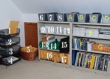
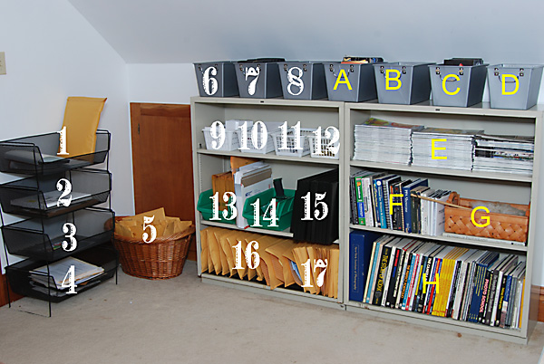
My area for these activities are confined to a 3 shelf bookcase and a set of 4 stacking bins as well as a few other baskets/containers.

Shipping Receiving

  1. Outbox – Orders that are ready for pickup by clients
  2. Inbox – Orders that need opened, packaged, invoiced, etc
  3. Inventory – extra order-type inventory that I have procured for samples that need an inventory adjustment before being used.
  4. To be filed – yep – this is the bin that is always full!
  5. This basket is for all the items that are ready to be mailed and just need taken to the post office. I transfer the contents to those cool re-useable grocery sacks with handles on errand day to make them easier to handle.
  6. Print Packaging Black Boxes – 4×6
  7. Print Packaging Black Boxes – 5×7
  8. Wallet Packaging
  9. CD Packaging Envelopes
  10. CD Packaging Trifolds
  11. CD Packaging CD Hubs
  12. Print Packaging – Gold elastic bands for black boxes.
  13. Bin of small padded envelopes for CD mailing. Standing beside it are a variety of larger catalog envelopes & USPS Priority envelopes.
  14. Bin of cellophane & packaging tape
  15. Print Packaging Black Boxes – 8×10 & 11×14
  16. Packaged Wootness t-shirts
  17. Padded T-shirt envelopes.

Because my office is so small, an adjacent area is also pictured, which is for:

Reference/Library

A. DVD Instructional Videos

B. Software CDs

C. Purchased Photoshop Templates on CD/DVD

D. Cans of air for cleaning keyboard & PCs (probably will be re-homed & something more pertinent will go in here later)

E. Magazines (Professional Photographer, Photoshop User, etc)

F. Books

G. Basket of items that do not belong in the office and need returned to their proper homes.

H. More books

So – there you have it – a small, organized area that will hold your basic packaging needs and keep the flow of materials in and out of your office in a more organized manner.

For those of you that have all the fancy packaging (i.e. bags, bows, tissue paper) this probably won’t work for you, but an additional space for those items would supplement this system nicely.

I hope you found this of some help. Please feel free to share photographs of your own space. Send your photos & descriptions to christine@wootness.net and I will feature some of the best ones in future articles.

8 Tips for Printing Inkjet Greeting Cards

It’s that time of year! You’re either sending your files to the lab to have your cards printed or you’re printing them in-house. If you’re printing them yourself, here’s a set of tips that will make the process easier for you.

These tips are courtesy Red River Paper. I am one of their Red River Pros and have had the great fortune of being able to use almost every single type of paper and greeting card they carry. I highly recommend that you check them out.

Tip 1 – Create a Custom Paper Size in your Printer Properties

In order to use most pre-scored inkjet note cards, you’ll need to define a custom paper size to your printer. Epson, Canon, and HP printers all have this feature. The trick is to always define paper sizes the same way. Set the width to the smaller dimension of your paper and the lenght or height will always be the longer dimension of your sheet. After that you only need to change the orientation button depending on how your greeting card is laid out.

Tip 2 – Use Photoshop or Photoshop Elements for best results

We recommend Photoshop or Photoshop Elements as your best option for greeting card layout and printing. The programs offer the most flexbility in terms of layout size, photo and text placement, as well as color management. Although Photoshop is an expensive program, the Elements version is quite affordable and offers all of the options you need.

Tip 3 – Print the inside of your card first.

If you want to print text or graphics on the inside of your card, print that information first. This means the photo side will only pass through the printer once, which limits the possibility of scratching.

Tip 4 – Decide if you want to print photos on the outside AND inside of your card before you buy your paper.

Not all inkjet printable card stock is designed for photo printing on both sides. Decide ahead of time on your design then make your paper purchase. If you want photos on both sides of the paper look for product that is called double sided, 2-sided, or C2S.

Tip 5 – Make sure your envelopes match the size of your card.

Greeting cards are usually sized to match envelope standard sizes. Here is a chart to help you verify your envelope size is right:

Card Size Before Folding
Envelope Name
Envelope Dimensions
8.5″ x 5.5″
A-2
4.3″ x 5.75″
9″ x 6.25″
A-6
4.75″ x 6.5″
7″ x 10″
A-7
5.25″ x 7.25″
8.5″ x 11″
5.75″ x 8.75″
5.75″ x 8.75″
8″ x 9″
#10
4.125″ x 9.5″
Baronial (Square)
Baronial Square
5.5″ x 5.5″

Tip 6 – Feed only a few sheets at a time.

Most inkjet printers are not really designed to take large stacks of card stock and feed them consistently. Be gentle with your machine and only put 5-10 sheets in the paper tray at one time. With extra heavy papers, or fine art cotton media, you may have to feed them one at a time. Some trial and error may be necessary

Tip 7 – Clean your feed rollers!

It is critical to keep the feed mechanism of your printer clean and free of inkjet coating and paper debris, which are key factors in paper misfeed. Go to www.redriverpaper.com/feed for helpful DIY cleaning instructions.

Tip 8 – When printing the outside of your card, make sure the photo side comes out first

Set your layout to that when you click print, the printer prints the photo side of the outside of your card first. This means the outside back of your card will come out of the printer last. This is helpful in preventing head strikes which can lead to black smudges on the edge of thick media.

You are NOT James Bond…

True stories:

1. A bride made an appointment to meet with me to discuss doing her wedding photography. She brought a bridesmaid with her. Not an unusual arrangement. However, the bridesmaid commandeered the conversation and asked questions about WHERE I had my prints made (ie what lab) and what paper they were printed on and HOW I designed my albums and WHERE I got those printed. The bride barely spoke. Midway through the meeting I asked the bridesmaid if she was a photographer because she was asking me more photography business questions than wedding photography questions. BUSTED. She was. She talked the bride into bringing her along so she could see my price list, contract and offerings and then undercut me. The bride didn’t bother letting me know that she wasn’t going with my services and I didn’t bother following up with her. I didn’t want her as a client after that.

2. My phone rings. I have a Smart Phone that is synced to my Facebook friends list. The name of a photographer that I was “friends” with on Facebook and had met at a speaking engagement I had several months before popped up on the screen. I figured he had some questions. Instead, it was a woman. She began asking me questions about my wedding pricing and offerings. She did not mention that she was the photographer’s wife (and business partner).

3. A photographer friend is an award-winning boudoir photographer that has recently relocated and is searching for models in her new location. She received an application from the wife of a… you guessed it…boudoir photographer.

Come on, people! Seriously???

In this day and age of Facebook, the www and other technological advances – you cannot hide. We WILL figure out who you are and you will forever be on our shit lists. We will tell our local photographer friends about what you did and it will take you a VERY long time to redeem yourself in our eyes and the eyes of our peers.

Don’t do it. It’s NOT classy at all. In fact, it’s downright insulting.

In the second example above – I told the caller I was confused, that it looked like she was calling from the number of a local competitor. She ‘fessed up and apologized. And you know what? I told her everything she wanted to know and sent her some links in an email to some suppliers I use that carry a specific product she was asking about. I ignored her faux pas and treated her as if she had been up front with me in the beginning.

I’m a soft touch like that. Other photographers probably won’t be.

So – if you wanna know something, just ask. Don’t be all private-eye-like and think you’re going to fool us. You won’t.

Some days I’m brilliant – this is not one of those days…

So, I’m happily humming along in my office, getting some orders retouched and generally happy with how much I’m getting done and how well I’m doing at staying caught up. I check the Wootness Facebook page and I see a post from a reader asking about their Wootness T-Shirt.

Uh-oh…

Yeah, I’m so organized that the shirts have been all packaged up for awhile now and were waiting in my little special box/basket #2… (or was it #3??) and were just waiting to be taken to the post office. I can only get to the post office on Saturdays and last week was a holiday weekend and the weekend before…oh heck ..who knows what happened?

But there you have it. Wootness FAIL. *sigh*

So – if you have been patiently waiting for a shirt – they will be shipped out TODAY. (All except for Carrie Calabrese – I had to order another one in your size, I was short one, sorry!)

I am now discontinuing the bonus shirt plan, so if you never placed your order for your shirt (which in turn provided Wootness with credit to buy these shirts and hand them out to you), you’ve missed your chance, sorry.

Keep your eyes open, though, because you will be able to get one of your very own in the soon-to-be-unveiled “Wootique.”

Yeah, I’m smarmy like that. 🙂