Get off the CLEARANCE RACK!

Every day on Facebook, I see a ton of those holier-than-thou you-suck-if-you-don’t-copy-and-paste-this-as-your-status stati.

This one made me stop and think. Instead of metaphorically speaking, apply this concept to your pricing:

If you’re not being treated with love and respect, check your price tag. Perhaps you have marked yourself down. It’s YOU who tells people what you’re worth by what you accept. Get off the clearance rack and get behind the glass where they keep the valuables! LEARN to value yourself more! If you do not, no one else will! Re-post if you like, you may help someone get off the CLEARANCE RACK!

There’s a valid point here. If you don’t charge what you are worth, people will not respect your work.

I’ve Been There Done That – Got the T-Shirt AND the KeyChain.

And that’s your Sunday Sermon. Have a nice day!

Testing 1…2…3…

[cc_full_width_col background_color=”f1f1f1″ shadow_color=”888888″ radius=”6″]Don’t freak out – you’re going to see some different formats and layouts over the next few days while I revamp the blog template. While I love the magazine format, it’s just not wide enough for the content. So – I’ll be testing some stuff over the next few. If you see something you absolutely love or hate, please drop me a message. :)[/cc_full_width_col]

Forget the insurance agent, get thee to the PPA!

The other day, I wrote THIS article about business insurance, liability, indemnity and equipment coverage and gave you some information about that.

Later that day, I began to hear rumors that the PPA was going to offer insurance options to their members.

I am absolutely ecstatic to be able to tell you that EFFECTIVE TODAY, all members qualify for the following:

This is a wonderful added benefit for PPA members (current members must opt-in to this coverage), and if you’re not yet a member, this should make the decision for you! Get going!

For full details on the new insurance benefits, click HERE

This totally deserves 5 Wootness! points:

Do NOT design your own logo!

We constantly harp on people to not try and do their own photos, to pay a professional photographer to do them, and then we turn around and design our own logo. Seriously? This does not get to be a “do as I say, not as I do” activity.

Pay a professional logo designer to do the work for you.

And try to stay away from anything that costs less than $150. You get what you pay for. You want your logo to express your personality and style – you don’t want it to just be a cutesy font and colorful polkadots or whatever is in style right now. Stay away from trendy stuff. For awhile I saw lots of teal/brown, pink/brown, hot pink/lime green combos. Those were totally color trends, which seem to last about 2 years. (Yes, I am guilty of the hot pink/lime green combo, which I used in 2007).

I would also stay away from those “pre-built” logo places. Maybe that’s all you can afford. Personally, I’d rather skip the logo than go with one I was only going to use temporarily.

This has been your short and sweet TGIF PSA. Now go have a drink and a nice weekend!

Do I have to buy Adobe Photoshop? and other post-processing quandries…

The short answer is “no.”

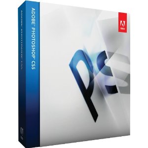
Most pro photographers are using some version of Adobe Photoshop for their post-processing.  I personally use CS5.

I understand that looking at the pricetag on the latest version makes you want to throw up a little, so I’m going to suggest an affordable alternative.

It’s called Adobe Photoshop Elements and it’s kind of like Photoshop “Lite.” You’ll get most of the basic features of PS at a fraction of the price.

You will have to spend some money on software, just accept that as a given. You will not be able to get by with any kind of free software – and for god’s sake, if I find out you are using that program which will remain unnamed* to process client portraits, I will personally seek you out and smack you a good one.

There are several DO NOT DO THIS pet peeves I have in regards to post processing and the use of Photoshop. They’re pretty standard pet peeves across the board, so if you can stay away from these, you will have a much better chance of keeping the respect of your peers and clients.

  • Photoshop is to be used to make slight adjustments to brightness & contrast and to make white balance adjustments. These are some of the very basics and basically clean up a photo. Photoshop is NOT to be used to rescue a bad photo. If you EVER look at a photo and think to yourself “I can fix that in Photoshop,” you’re heading down the wrong path. Photoshop is to be used to enhance a photo, not rescue it from the trash bin.
  • Photoshop is not to be used to apply drastic special effects to a photograph. Yes, the program has that capability. JUST BECAUSE YOU CAN DO IT, DOESN’T MEAN YOU SHOULD.
  • Spot coloring is an overdone effect. Do it once or twice per client, but no more. Be VERY selective in its use. Yes, people will think it’s nifty. At first. After that, it looks cheesy and you may as well be wearing a plaid suit and a comb over.
  • Stay away from white and black vignettes.  White ones are cheesy and black ones work well when they’re done well, but hardly anyone does them well. If I can see the vignette, it’s not done well. Practice this privately until you get it right. Do not post your practice ones anywhere but on a photography-education-oriented site until you learn to do it properly.
  • Stop it with the fancy-ass borders. Just stop.
  • Do NOT put text on a photo. Just don’t. Cheesy style #3. If you simply MUST use text – SPELL ALL OF THE WORDS RIGHT!! And DON’T use Scriptina, Papyrus, Monotype Corsiva or Passions Conflict. These fonts are totally overused.

* I said it would remain unnamed. Did you really think I was going to tell you?

Props do not a portrait make…

I cannot count the number of times that I’ve had a high school senior and parents come into the studio for their appointment and one of the parents has requested the big number 10 (or 11 or 12). Seriously? Did you even LOOK at my website? Where in the world did you get the impression that I use the big numbers or any other prop for that matter?

Props drive me crazy and unless a client brings a specific item to their session, I do not use them. At times a senior will bring a musical instrument or some other item that represents their interests and these are not the types of props I’m talking about.

What I’m referring to are the props that are used for the sake of having props. Like  leg warmers on babies. Seriously? That is like the stupidest look ever! I’ve NEVER seen a baby in a pair of these things in real life, only in a photography studio.

For awhile tutus and striped tights on little girls were all the rage. Ugh! Or how about those big wide crocheted headbands with flowers hot-glued to them that are almost as big as the head of the newborn who is wearing it? Just shoot me now.

Now before you get your big girl panties in a wad – let me clarify.

The photograph should NOT be about the prop. The photograph should be about the client – not what he/she is wearing. If the client has something special to wear that means something to them personally, then by all means, go for it. But if the client is being dressed in accessories provided by the photographer that have no meaning whatsoever to the client, then I have issues with that.

Too many times I see props take center stage in a photograph and clients get all “OhEmGee!” about the photo, when realistically, the prop is doing nothing other than pulling the attention away from the fact that the photograph is under or over-exposed, poorly posed and has wonky color balance.

Learn to properly pose and expose a photograph before you jump onto the prop bandwagon. I’m more likely to give you a little less guff.
Is it okay to offer CDs?

Greta asks:

In your opinion, do you think its ok to offer CD’s? I can’t decide whether or not to offer them or not. I don’t want some of the problems that come along with it (i.e. re-editing/posting) I personally do not want a CD from any photog OR studio (back in the day) when we get pics done.

I don’t know – what do YOU think?

So often new photographers ask this and similar questions and then are bombarded with opinions, which just serve to further confuse the issue.

None of us are the perfect photographer or the perfect businessperson and none of us can give you an answer  to what is truly a personal decision.

It’s okay to offer CDs if YOU would like to offer CDs. (For the sake of clarification – I am assuming we are talking about high resolution digital files). If you do not want to offer CDs, then don’t. It’s your call. Your business. Your decision.

Sure, you can ask for input and opinions, but like belly-buttons, everybody has one.

You can sell whatever you want. You can package roasted peanuts and sell them in your studio. Perhaps you have a circus theme. Perhaps your last name is Ringling. Perhaps you’re just weird.

The point is – don’t let me or anyone else tell you how to run your business. It might be easier to ask other established photographers what they do and then go along with the majority, but why? If you cannot give good solid reasons for why you conduct business in a certain manner, then you don’t believe in what you’re doing. Photography is not a a standard cookie cutter type of career. Personalize your business with offerings and decisions that are meaningful to you.

So, while I am not adverse to offering sassy advice about what NOT to do, I won’t be holding your hand and telling you what product line to offer or what pricing to place on your work. Put them big girl panties on and suck it up a little and make some hard decisions on your own. You’ll be prouder in the end.