Take a look at this image. A really good look. Pretend you are a judge. Pick it apart and tell me what’s wrong with it. Take a moment, I’ll wait while you ponder…
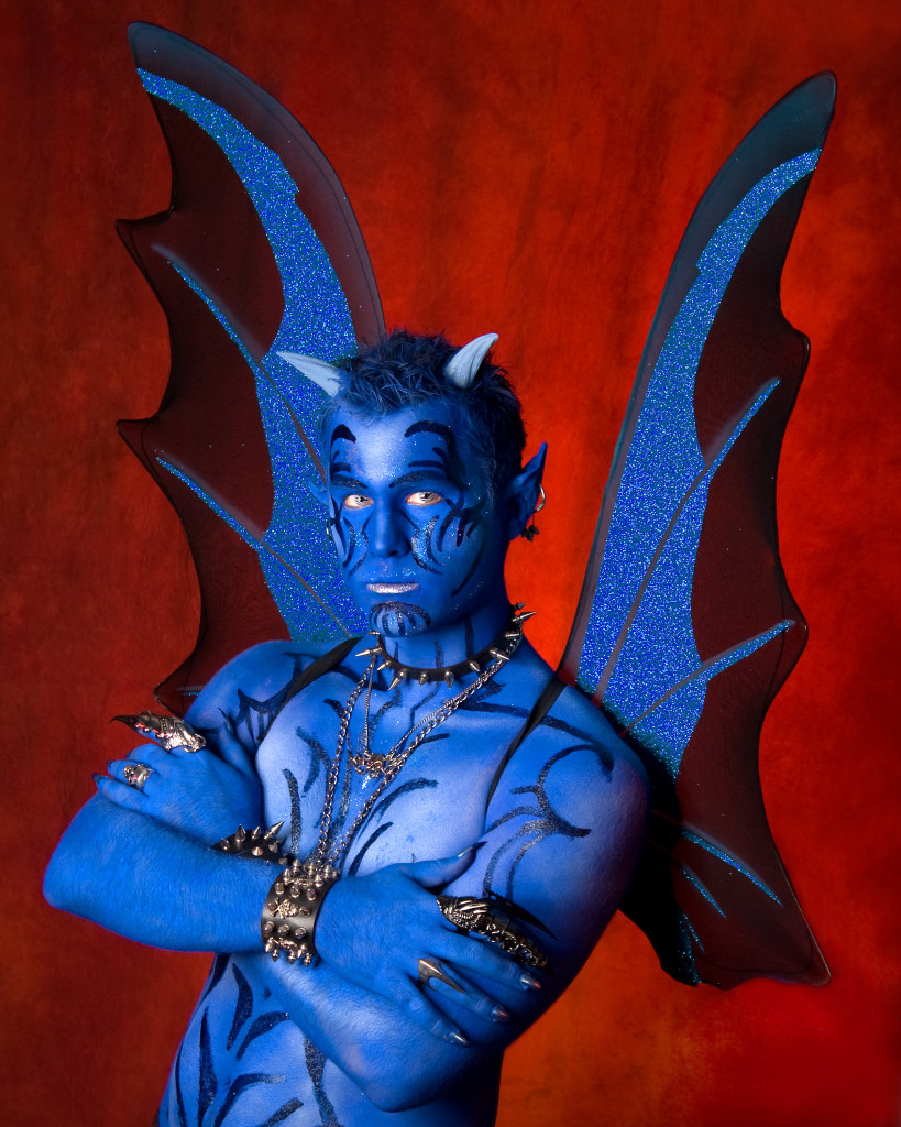
Does anything jump out at you?
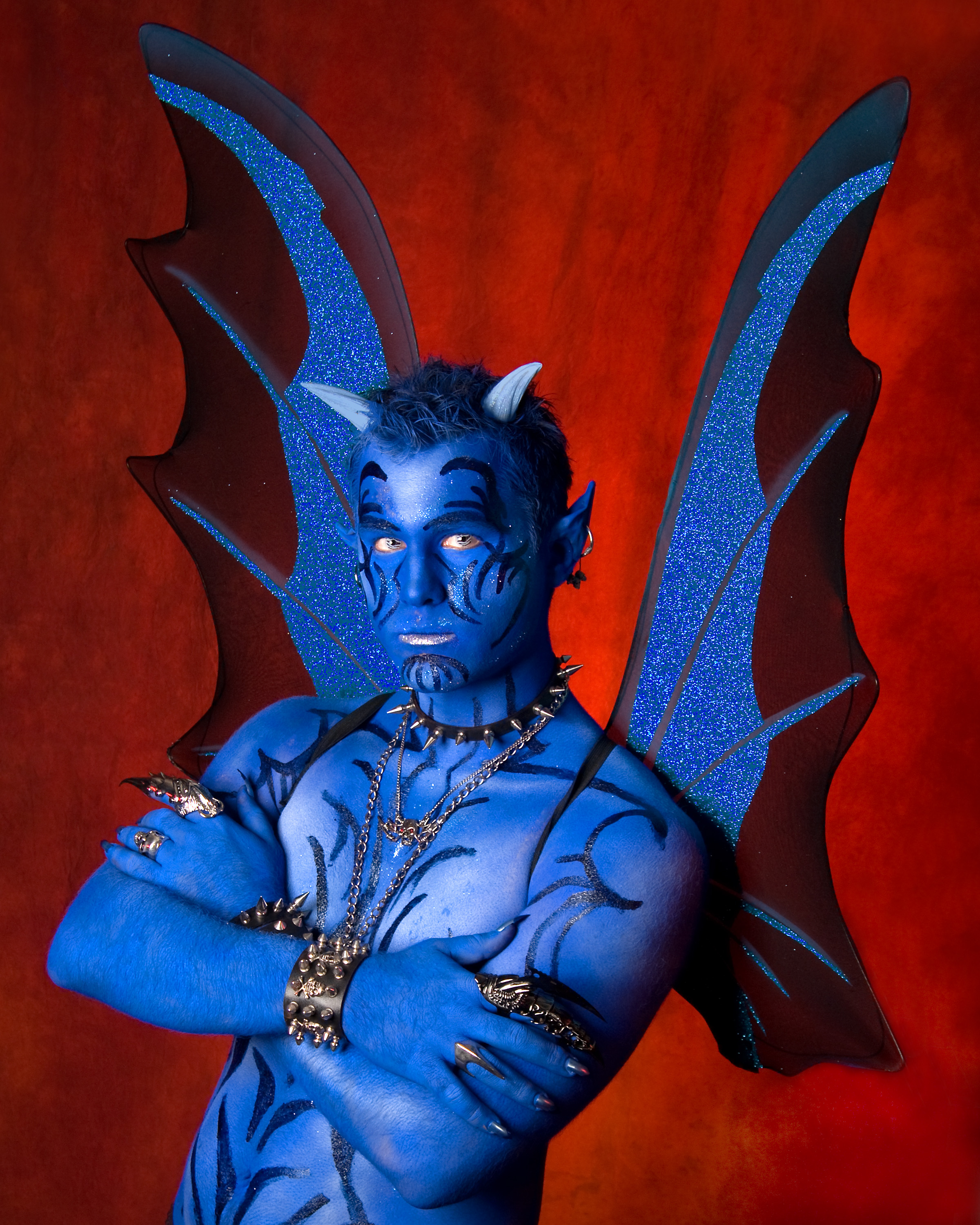
Here’s a hint – the finished image:
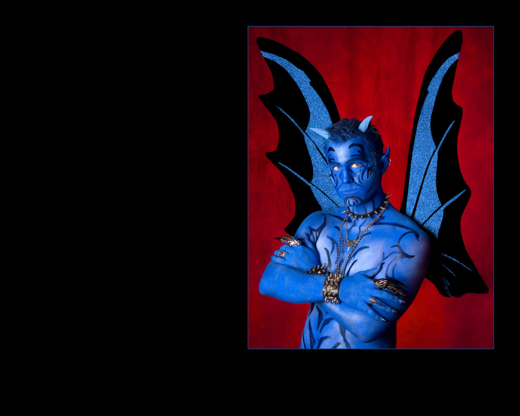
If you’re still struggling – take a closer look at those wing straps – the first image shows them, the second image does not. The second image is from my very first IPC case in 2010 and it earned a merit. During the course of working on it and prepping it for competition, I asked some advice on it. PPA Affiliated Judge Keith Howe asked me the question
“Is this a devil, or a boy pretending to be a devil?”
In other words ‘lose the straps on the wings, we aren’t playing ‘dress-up” here’ (my words, not Keith’s).
This CC made a lot of sense to me. Before photography, the occupation that involved a lot of my free time for the past 30+ years was working at my local community theatre. Over the course of the years, I’d learned to be diligent about propping a production correctly. We would be inviting hundreds of audience members to join us in the suspension of reality. Yet, we still needed to be realistic. If we were to bring you fully into the proper viewing of our play, we need everything about it to be believable; realistic. If I wanted you to believe a dude was a devil, I certainly wouldn’t have him sporting a pair of wings with straps, right?
That’s pretty much how it should be with competition prints, as well.
Your audience is the judging panel. You want them to buy into your story, to be drawn into the image you have created. You’ve paid wonderful attention to your lighting and posing. Now pay attention to the realism factor.
Perhaps you’ve decided that a formal portrait of a woman in an 1800’s ballgown is your next project. Maybe it’s because you found the most awesome dress and became inspired. That’s so cool! And exciting!
But don’t get lost in the wave of creativity that is swirling around you. You need to pay attention to the hairstyle, the makeup, the piece of furniture that you will most likely be using as a prop. And even though the ball gown is long and may cover it up, you’ll want to make sure the footwear is time-period appropriate, as well.
After all this is prepared, you should be ready to go, right?
Take another look. Everything in that image needs to be correct. And I’m betting if you look a little closer, you might find something that’s an issue.
Like hoop earrings.
Or a currently fashionable ring.
Or that ombre haircoloring that’s presently in style.
Look at the floor – is there a carpet or floor covering present that is appropriate to the subject matter? Is every prop, every part of the costuming, every part of your scene tied into the believability factor? Every single thing you add to your image MUST support your concept.
This isn’t official PPA print competition advice, but it’s a process that I utilize in my own entries that I think would be of benefit to competitors who find themselves shooting time-period-ish images.
Here’s another example:
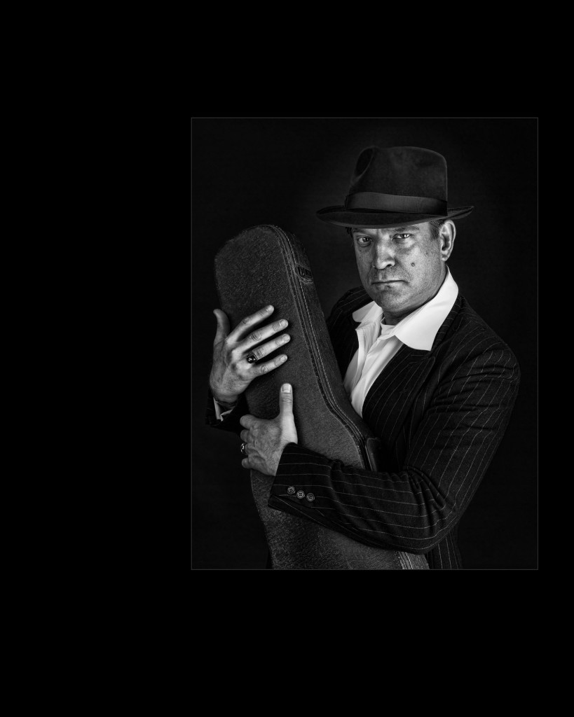
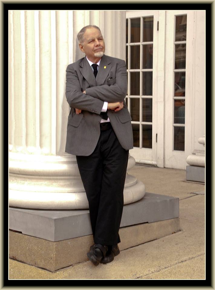
This image was set in the 20’s. This fellow (Scott) is an actor and had just finished filming a movie called Sugar Wars, which inspired the shoot. [Movie info/FB page HERE]. It had to do with the Mafia, Hit Men and other assorted unsavory characters.
Scott provided his own clothing for the shoot – a practice that I rarely support, but since he is a bona fide vintage clothing expert, he was the perfect person to allow this freedom. [Check out Scott’s project The Fedora Lounge].
I provided the viola case. Note that “viola” is an important word. I had done some research about hit men and Tommy Guns. I did not have a Tommy Gun and didn’t really want one – I’m not all that crazy about putting weapons in comp prints ( a personal work preference only and does not affect how I judge images with weapons) – but I wanted to provide the illusion of a weapon. He was a gangster, after all.
I did some research on Tommy Guns and discovered that they were actually too large to fit in a violin case and required a viola case. That may be an insignificant difference to most people, but to me – it was enough of a difference to assure I had the right case available for the shoot.
Another detail item in the image was the signet ring that Scott wore. It is the letter “D” and stood for his last name. I flipped the image for presentation and of course, the initial has been flipped, as well. I knew this might be an issue and spent some time looking at the image and finally decided that the fancy script of the “D” practically rendered it unreadable in the correct orientation, anyway, so didn’t fret too much about flipping it. (But normally, you wouldn’t want to flip anything with text in a comp image – so pay attention to that kind of thing.)
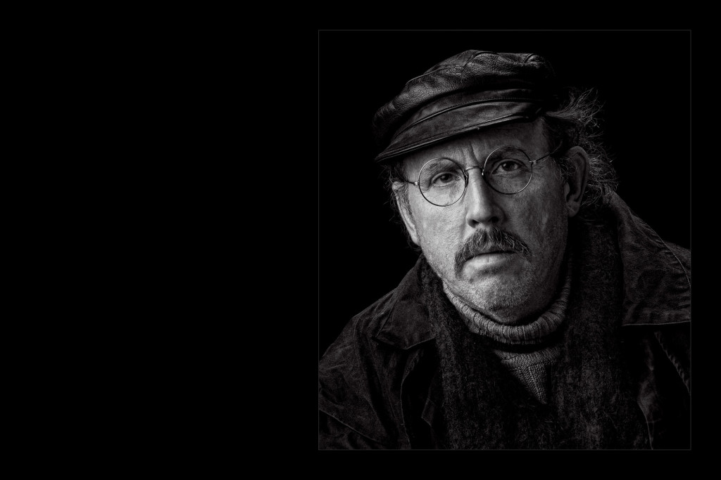
Eyeglasses are another thing worth considering. This image was enhanced by the use of more traditional-looking, classic glasses and we would not have gotten quite the same impact with a set of horn-rimmed ones, you know?
The next time you’re prepping for a shoot, whether it be for competition, a client, or personal project, I encourage you to really consider every single item you bring onto your “set.”
This IS a production and you ARE the director.
Give us, your audience, the opportunity to respond with a standing ovation because you completely sucked us in to your reality.
